In today’s digital-first world, having a beautifully designed website isn’t just about aesthetics; it’s about creating a seamless user experience that guides visitors through a journey of discovery, engagement, and action. Whether you’re a business owner, a web developer, or a designer, understanding the principles of great web flow and design is essential to crafting websites that not only look good but perform excellently.
The Importance of Intuitive Design
A well-designed website is intuitive and easy to navigate. Users should not have to think too hard about where to click next or how to find the information they need. The goal of intuitive design is to make the journey through the website as smooth and effortless as possible. This is achieved through logical page hierarchy, clear navigation, and a consistent layout throughout the site.
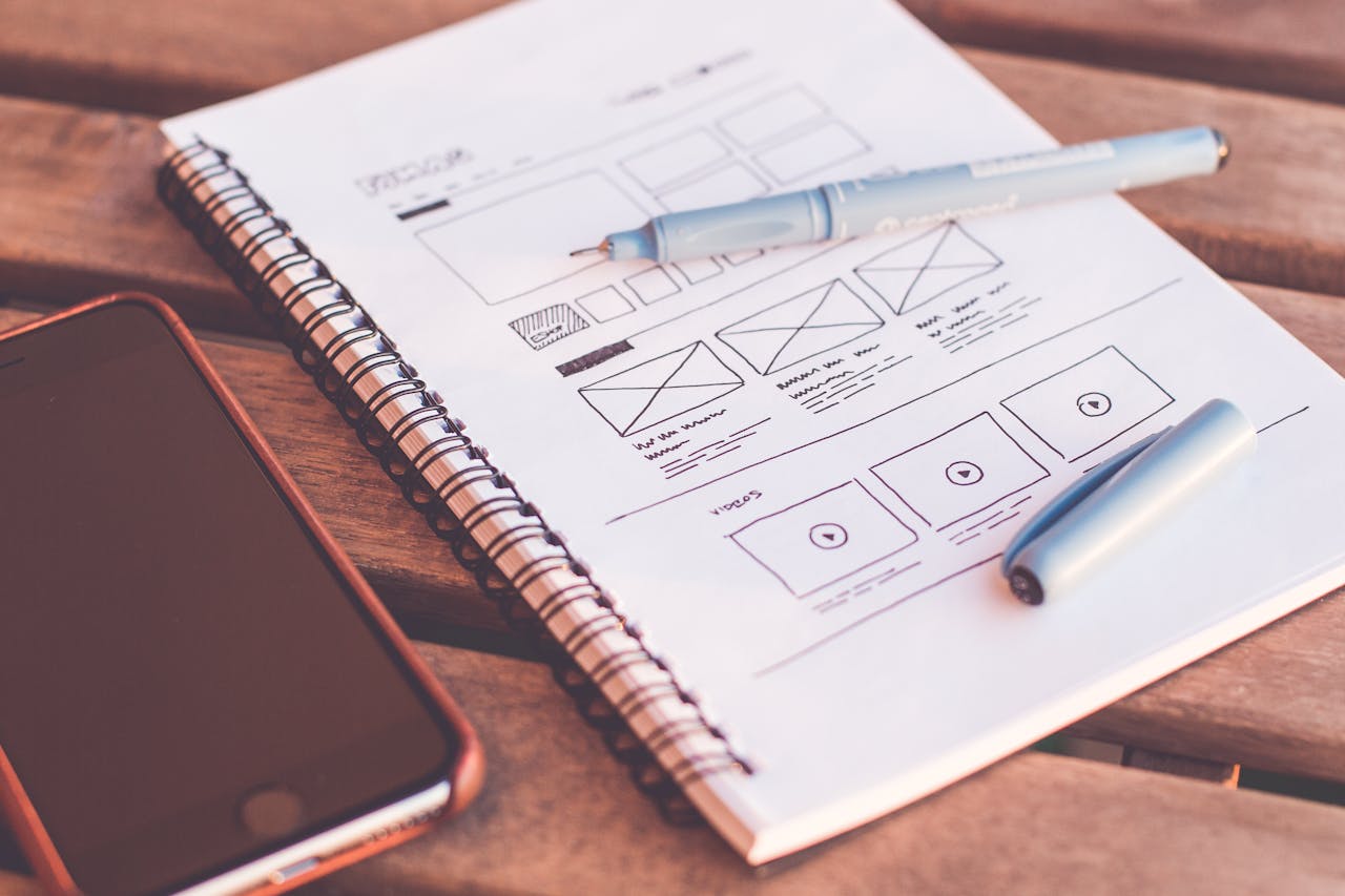
Layout: The Backbone of Web Flow
The layout is the structural foundation of your website. It organizes content in a way that makes sense to the user and enhances the overall flow. A good layout keeps balance, consistency, and alignment in check, which not only pleases the eye but also supports the functionality of the site.
Key elements to consider include:
- Grid Systems: These help in structuring your layout and keeping your design elements aligned and uniformly spaced.
- Visual Hierarchy: This involves arranging and presenting website elements so that visitors naturally gravitate towards the most important information first.
- Whitespace: Ample space around elements helps reduce cognitive overload and increases content readability.
Navigation: Simplifying the Journey
Navigation is a critical component of web design that should align with the expectations of your visitors. It acts as a roadmap and should be accessible and straightforward:
- Consistency is Key: The navigation should look and function the same on every page.
- Strategic Positioning: Typically, navigation menus are placed at the top or left side of a page as these areas are where a user’s gaze naturally begins.
- Descriptive Labels: Navigation options should be clear and descriptive to ensure users know exactly what to expect when they click on a link.
Responsiveness: Essential in a Mobile-First World
With an increasing number of users accessing websites via mobile devices, responsiveness is non-negotiable. A responsive design automatically adjusts to fit the device it’s being viewed on, providing a pleasant experience for all users. This not only improves usability but also contributes to SEO as search engines favor mobile-friendly websites.
Color and Typography: Enhancing Usability and Aesthetics
The choice of colors and typefaces can deeply affect the look and feel of your site, as well as its readability:
- Color: It can be used to draw attention, group related items, indicate interactivity, and create mood. The color palette should reflect your brand and be pleasing to the eye.
- Typography: This should ensure that the text is easy to read and appealing. Good typography will guide the reader’s attention and make the act of reading enjoyable.
Testing and Feedback: The Final Frontier
No matter how good your design is, it’s crucial to test it with real users to ensure it works as intended. User testing can reveal unexpected issues and provide insights that you might not have considered. Incorporating regular feedback and making adjustments based on user interactions are vital for maintaining an effective web design.
Conclusion
Great web flow and design are about creating a user-friendly experience that makes visitors want to stay, explore, and convert. By focusing on intuitive navigation, responsive layouts, and compelling aesthetics, you can ensure that your website not only looks stunning but also offers a seamless and engaging user journey.
Remember, in web design, every little detail counts. Your website is often the first point of contact with your audience, so make it count by making it both beautiful and brilliantly functional.